100 signatures reached
To: Ofcom
Newspaper corrections should be the same size as the mistake!
If newspapers had to publish their mistakes in the same way they publish incorrect headlines and articles, they'd think twice about publishing wrong facts. All corrections should be published in the same size font and on the same page as the original article.
Why is this important?
We saw lots of tiny corrections following big (and incorrect!) headlines during this election campaign. The changes to the way corrections are published was a key recommendation from the Leveson Inquiry that both the Conservatives and Labour agreed to adopt. It's time for Ofcom to make sure corrections are the proper size and place.
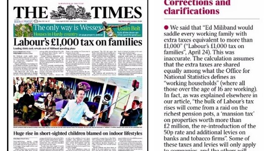
The Times front page from 24th April 2015 had the headline 'Labour's £1000 tax on families' - it was completely inaccurate. The Times published a correction on the 2nd May, but it was buried deep in the paper. If they had to publish their correction on the front page - where the original article sat - it would have been a prominent and therefore just correction. The front page would have looked like this: 'Our headline about Labour's tax on families was inaccurate: Some of these taxes and levies will only apply to companies, and the others will affect a small minority of families, not “every working family” as we reported.'
It would be a just and fair way to report corrections that would have a deterrent effect on mistakes, media bias and failure to check facts.